Custom Logo Design

Custom Website Design

Custom Banner Design

Brochure Design

The Logo of the 2010 FIFA WORLD CUP SOUTH AFRICA

Wednesday, December 30, 2009


The coming year will be the year of Soccer lovers, the year for the Fifa World Cup 2010. In May 2004, FIFA awarded the hosting of the FIFA World Cup to an African country for the first time in the 101 years of FIFA’s existence. As the host, South Africa stands not as a country alone – but rather as a representative of Africa and as part of an African family of nations.

Hence, the logo design of the Fifa World Cup 2010 depicts the same essence and shows the map of Africa with blue, green, red, yellow, black and white stripes of South African flag. The design is dynamic and embodies the burning passion of Africa.

A bicycle kicker in the Fifa logo symbolizes the passion of soccer not only for African people but for those of around the world.

Free Christmas & New Year Premium Greeting Cards from Logo Design Consultant

Wednesday, December 16, 2009


The Logo of the No. 1 Content Management System: Joomla

Tuesday, December 15, 2009


Joomla is an open source content management system platform for publishing content on the World Wide Web and intranets. It came into existence on August 17, 2005 as a result of the fork of Mambo. Joomla! has now becomes the no. 1 content management system in the world.

When we talk about the logo design of this state of the art content management system, we see logotype and the mark in it. The mark represents the community joining together as one. The mark consists of 4 “J’s” linked together with each other depicting the unity, legibility and visibility of the Content Management System.

Undoubtedly, Joomla logo design is highly creative work of art and the real representation of the system.

The Logo of the Power Brand: Harley Davidson

Friday, December 11, 2009

The famous logo of Harley Davidson is undoubtedly one the most famous logos in the world. People, who own the Harley Davidson bikes, feel the extreme pride of having it. The logo design itself is a power, a power to rule the roads.

This famous logo is generally referred to as “Bar and Shield” logo. Harley Davidson  logo has been licensed by the company. Therefore, whenever you would purchase a Harley Davidson belt buckle, pen or sticker, part of that income would go to Harley Davidson Company.

Furthermore, every Harley-Davidson dealership has a shop logo, a design that says something about the dealership and which sets it apart from every other dealership in the world.


The Famous Logo of the German Puma

Wednesday, December 2, 2009


The producer of high end athletic shoes and sportswear, PUMA, a large Germany based multinational company is best known for its soccer shoes and its famous logo, the leaping puma.

Rudolf Dassler, in 1948, separated himself from Adidas (owned by him and his brother Adolph Dassler) and founded his own shoe company called Puma. It is currently being the third largest company after Nike and Adidas, and has been producing and marketing line of products including footwear, apparel and accessories. Now, Puma has been serving more than 80 countries.


More than 30 national football teams are sponsored by Puma. Also Puma has sponsored international soccer stars including Pele, Enzo Francescoli, Diego Maradona, Johan Cruijff and Lothar Matthaus. Key products in Formula One and NASCAR, enthusiast driving shoes and race suits, are also being produced by Puma.

Today, a leaping puma in Puma logo has become the powerful identity of Puma along with best performance, design oriented athletic shoes and other sportswear.

The logo design of puma was first created in 1948, and still in use with few modifications. It consists of an image of a leaping Puma, an animal also called a cougar, a panther or a mountain lion, with bold typeface. The image of Puma depicts the powerful identity of a company and its products.

Puma logo is multifunctional and can be used for different purposes easily without losing its original integrity. It has been reproduced in different sizes and colors without altering its original identity i.e. Puma.


Top 3 Famous Logos of English Premier League

Thursday, November 26, 2009

Soccer logos ultimately represent a team and most of the time they are the ones that help create a very immediate recognition about the specification of that certain team. There are so many logos for soccer around the world due to the many soccer tournaments that are held in almost every corner of the world.

English premier league is one of the most famous tournaments of soccer in the world because England’s top most clubs performs on its platform every year. And they have made their authentic identities there by their exclusive play of soccer and their embarking logo designs, which are their emblems of recognition.


The famous logo designs of the top 3 soccer teams of the English premier league are as follows:

These logos are well-conceptualized forms symbols that display an iconic emblem of uniqueness. Each logo is different and that's what makes it stand out among the rest.

Manchester United Logo Design

Known by the nickname of The Red Devils, this is the richest club in any sport in the world and also has an astounding logo design which posses the true ambitions of the team. This logo pretty much has it all. The devil rocks, the ship is sweet, the colors are bold and interesting, the feel of the logo is very state-of-the-art, but it still retains a classic coat-of-arms look. It's simple, it's understated, and yet it conveys so much and is recognizable throughout the world.

Arsenal Logo Design


Known by the nickname of The Gunners, Arsenal are among the favorite rivals of both, Manchester United & Chelsea. The logo design contains an old 17th or 18th century canon and a shield which is the representation of the kingdom war weapon. The logo design is a perfect representation of the team.

Liverpool Logo Design


Known by their new nickname The Reds, Liverpool have a good offensive lineup of its logo design. You will never walk alone line is attention grabbing. The shield contains an Eaglish dragon. The fire torches around showing their passion towards the soccer game and the crest is defining the year of formation of the club.

Logos provide a standardized distinction and representation of specific groups, things, organizations, in this matter, teams. Having English Premier League logos takes us back from the old civilizations where they use emblems as their forms of representations.


Logos of Indian Premier League- Pick the Best One Out!

Saturday, November 21, 2009


DLF Indian Premier League (IPL) Logo


After the inauguration of the most famous twenty-twenty cricket extravaganza in 2008, the world is compelled by their organization and powerful marketing, which brings them the ultimate success in the turnaround of millions of dollars.

The extreme logo designs are the most prominent features of the DLF IPL teams, here I am giving you a brief review of these fashion oriented famous logo designs, and how these logo designs became the emblem of every braded team.

Here is the IPL team logos arranged in an alphabetical order:

Bangalore Royal Challengers Logo

The logo design of the Bangalore-based cricket franchise brand is a simple and elegant design consisting of the initials “RC” written in gold color in a classical typeface, and encircled by the team name with the crest of McDowell Royal Challengers, the top-selling liquor brand of Vijay Mallya – the company and the team owner.

Chennai Super Kings Logo
The Chennai Super Kings logo features the head of a lion in orange/gold color with the team name typeset in the whitespace available at the side of the lion’s head. The inspiration behind it is the belief that the lion is the king of the jungle. The minimalist approach (thin lines, sharp corners) signifies youth and vibrancy. On the other hand, the heavy lettering signifies a solid performance orientation.

Deccan Chargers Logo
The logo design of the team is representing the state of Deccan. The logotype elements such as the crest, stripes and a serif font set employed intelligently to form a contemporary logo design which genetically relates with logos design of European football teams. The slogan of the team “The Unstoppables”, written in a non-serif typeface, forms a tagline just below the crest.

Delhi Daredevils Logo
The logo design of the Delhi Daredevils is featuring a Firry cricket ball pacing with the motive of Going Ballistic. Its tail is assigned by the team name showing the fire fear spirit. The famous logo design is a hefty inspiration of Grunge Art.

Kings XI Punjab Logo
The famous logo design of the Kings XI Punjab is the classic product of the old kingdom logo designs. The logo design consists of a shield on which the name of team and two lion faces are planted beautifully. Bold fonts and block letters are used. The crest epitomizes pride, valor and the mark of a winner.

Kolkata Knight Riders Logo

The most famous team because the owner is Bollywood king Shahrukh Khan. The Logo design of the team from the eastern city of Kolkata features an angled and blazing golden-colored Viking helmet against a black backdrop. The team name “Kolkata Knight Riders” is decorated in gold color alongside the graphic in a highly stylized custom-designed typeface.

Mumbai Indians Logo


The Mumbai Indians logo is a modern, contemporary sports team logo featuring a rotating Sudarshana Chakra , Sudarshana Chakra is a sharp-edged weapon predominantly used by the god Vishnu in Hindu Mythology. The orange and green colors are taken from the Indian national flag and point to the “Indians” part of the cricket team’s name.

Rajasthan Royals Logo
The famous logo design of Rajasthan Royals bears a style, the eventual winners of the inaugural IPL league, is a classical, blue and gold-colored logo design which is featuring lions reflecting royalty, might and raw power and the long horns, which are historically associated with the Rajputs.

So which cricket team among these do you think has the best logo?


Famous Logo Success Stories

Sunday, November 15, 2009

Quoting Sol Sender (who led a design team for the Obama 08 famous logo):
“The strongest famous logos tell simple stories.”

WE perceive a sign, an emblem a product brushing it off without realizing the hard work that has been poured in each one of them. Though, some famous logos that have actually with stood the test of time make us all curios to know the story behind their creation and success. How the famous logo did come into existence? When? And who was behind the artistic creation?

Here are some really interesting success famous logo stories of the
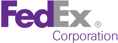


1. FedEx

This famous logo for Federal Express was designed by the well know designer Walter Landor of Germany who died in 1995. On the suggestion of the designer the company shortened the name from Federal Express to the syllabic abbreviation Fed Ex by which it is known today all over the world. On a closer look at the famous logo you will see the well defined font used to speak of the professional attitude of the company. Though the famous logo may appear rather simple on a closer look you will see the negative space arrow between “E” and “X” as pointing forward movement. Much symbolic of how federal express has been moving forward from the time of its inception and not looking back. The brand is so well known and so extensively used that people refer to mailing as “I’ll FedEx you the documents”. An interesting affirmation of that being constant references to Fed Ex made in Hollywood movies like Cast Away, Cheaper by the dozen, I Robot and Run Away Bride.


2. Domino's Pizza

Dominoes Pizza founded by Tom Monaghan, currently boasts about 8,500 corporate and franchised stores in 55 countries, including all 50 US states is the second-largest pizza chain behind Pizza Hut in the United States. Probably everybody around the world recognizes the blue and red famous logo of Dominoes pizza. Sporting with the colours of the United States Flag the two dominos may appear symbolic of the name, but very few know that the
“The three dots on a Domino’s Pizza box represent the first three Domino’s stores. Monaghan had planned to add another dot for each new restaurant that opened, but given the rapid rate at which Domino’s opened new stores, that quickly became impractical.”


3.
Apple

The famous Apple famous logo has many stories attached to it. Which makes it probably the most discussed famous logo after Nike’s Swoosh and Mac Donald’s “M”. Primarily the first association any one could think of is biblical, where apple represents the unreachable fruit of Knowledge. Though, the apple famous logo has seen through evolution

With the first famous logo designed by Ronald Wayne showed a complex caricature of Isaac Newton sitting under an apple tree, associated with the discoveries that followed by Sir Isaac Newton after the falling of an apple from the historical apple tree. The famous logo inscribed: “Newton…A mind forever voyaging through strange seas of thought…Alone”

Though it was soon replaced by Rob Janoff’s “Rainbow apple” referred to as “the most expensive bloody famous logo ever designed” by the President of Apple.

The bite on the apple referring to the bite/ byte pun, (Apple’s famous logo then was a byte into the apple). Some also say that the bite pays homage to the mathematician Alan Turing, father of modern computing, who committed suicide by eating an apple he had laced with cyanide. The Rainbow Apple's base structure became the template for Apple's current famous logos


4. Adidas

The Adidas famous logo, one of the most recognizable famous logos of the world was created by founder of the company Adi Dassler, appearing first in 1971. There are millions of things that can be said about the famous logo and multiple interpretations can be ascribed to it. Though the simple fact is that the three stripes designed in a shape of the mountain to speak of the determined attitude of the company to overcome any uphill task and challenges ahead. Adidas now enjoys the position of being the second largest sport retailer in the world.


5. BMW

The BMW’s famous logo has been around from a while. People presumed that the BMW famous logo shows a rotating propeller though later it was revealed by the BMW authorities that the famous logo has nothing to do with a propeller. The checkered blue and white design is taken from the Bavarian flag, the German state home to BMW.


6. Nokia:

Who in the world cannot recognize what a Nokia is? The Nokia brand, valued at $34.9 billion, is listed as the fifth most valuable global brand in the Inter brand/Business Week Best Global Brands list of 2009 (first non-US company).It is the number one brand in Asia (as of 2007) and Europe (as of 2008).People often wondered what is the story behind the first Nokia Company famous logo.

In 1865, Knut Fredrick Idestam established a wood-pulp mill in Tampere, south-western Finland. It took on the name Nokia after the mill was moved to Nokianvirta River in the town of Nokia. Probably that’s what the first Nokia famous logo depicts. The word Nokia in Finnish means a dark furry animal recognized as Pine Warten Weasel. The second showed the text branded, the third one with the arrows depicted communication, until finally evolving into the Nokia connecting people famous logo we recognize.

Hope you savoured the remarkable stories of these some of the very famous brands and companies that are recognized world wide just by a glimpse of their logos. You can leave back some comments if you enjoyed reading!

Batman Logo: the Symbol Says all about the Powers of a Super Hero

Friday, November 13, 2009


The Batman logo could be said as one of the most recognized logos among all comic super heroes after superman logo. The logo consists of the classic spread winged bat within a yellow oval. This symbol used in the original comic book, the original television series and the first two Batman movies.

The contemporary Batman logo was brought in a third movie on his chest. The style of a logo was same but it was without the yellow oval shape.

The forth movie came with a new character called robin. Logos of the both, the Batman and the robin, created the grabbing effect over the audience. Several animated cartoon series of the Batman have been telecasted on the television over the several years.


The logo of the forth movie of Batman was quite similar to the original logo in animated Batman series, but it was without the yellow oval, which makes it a more powerful emblem. This logo was also very similar to the logo in justice league animated series.

Consequently, a completely different Batman symbol appeared in another animated movie, called Batman Beyond. This logo was shown on his chest included with a red wider and pointer bat. Lately, a new style of Batman logo has emerged in a new series of Batman Movies. This symbol is fully black, and only outline of the symbol can be seen on his chest. This was again an innovative symbol.

Apart from the conventional Batman logo, which contains a bat, the character also has trademark symbols containing the face of the dark night spelt out with his name. The logo for merchandise comes with some transformation to make it up to date with time along with classic looks on the other hand. This logo design has been added with simple blue flames.


When it comes to Famous logos-simplicity, my friend, is the best policy

Simplicity is the best policy. Yeah it’s hard to believe but pick on any famous logo and you’ll see how the simple ones are the famous ones too. As apparent as it can be the Nike Swoosh or Mac Donald’s “M” may invite many intellectual interpretations and logo rationales but the truth is it is as simple as any message can be framed.

In fact it is an effort on every professional logo designer’s part to pour in all their energies in the famous logo as to make it look simple and as natural as the first impulse.

Here are the examples of few very simple famous logos that work like a stamp. No matter how simple they may appear they have good thinking time invested in them.


Look at this I love New York famous logo for instance; it may appear simple with the message clearly displayed in acronyms. The heart of course representing love and NY stands for New York. This logo was developed to promote tourism in New York and not much needs to be said about the success of it. This famous logo is recognized worldwide in all continents alike. Owing to its simple design it’s easy to remember and recreate.

Here some new logos that follow the same principle of simplicity and it’s very easy to gauge whether they are still able to retain your attention as an audience or not.


This simple yet memorable famous logo is representation of a good famous logo, with an interesting play with typography making the name self explanatory. Though simple the playing dead killed “I” is interesting for the beholder no matter who the target audience may be. This famous logo can be easily marked as being very simple, very representative and highly effective.


This famous logo doesn’t even need much explanation. With the growing awareness of psychological disorders everybody is aware of Schizophrenic condition of drastic mood swings and mood disorder. You can see that very aptly framed by a curve with the two colons on the either side. One showing smile and the same curve transcending into a sad face. Clearly bringing out, the thin line between the two absurdly swinging moods of a schizophrenic. The retention of this famous logo and the organization named “Schizophrenic”, is undoubtedly high.


Here is another interesting example of a famous logo playing with the typography to convey an idea vividly. Meaning of the word depicted with the c shaped like a question mark. Also you will see in this famous logo the phonic sound of “Qurious” being represented by the “q” shaped “c”. “Q” again being representative of question. The font chosen is scholarly and appears to bring forth a literary impression.

Here is another example of “talk more” famous logo design with the simple text cleverly articulating the message .The “a” and “e” cleverly replaced by quotation marks. The orientation of quotation marks directed at the absolute opposite sides depicting openness and infinity. Thus the speech quotations that bound a line or conversation is now free for its limitation of quotation marks with the power to talk freely with no finite boundary to adapt itself to. The simple typo in this famous logo also shows freedom from the complexities of the calling charging systems.


This famous logo is another interesting simple logo that incorporates the text candy along with the associated image of a young girl and a smiling face with incomplete set of teeth. With “a” and “d” shaped like by two eyes “n” like nose and “y” to make a curvy smile. The font chosen is exuberant and lively. Don’t you think this famous logo is effective and easy to retain?

As Robert Gunning puts it “It is simple to be complicated but it’s very complicated to be simple”

Halloween Extravaganza of Logo Designs

Saturday, November 7, 2009

Halloween occasion is such a fun packed extravaganza. It’s an opportunity to dress up wildly, eat loads of chocolate and have a scary manifesto.

The occasion holiday usually presumed as the day of meeting friends, eating out and especially party all the night. Like most of the holidays like Christmas, Easter etc. Halloween is also an occasion when the market gets a boost up for retail sales different commodities from human accessories to online sites. And this is the great opportunity to turn your sales in to profit by getting an exciting plus frightful logo designs.

Halloween has just passed away and leaving us behind some of the best memories in the logo design world. Halloween occasion is a huge market for the online logos design. Many online branding firms get their occasionally fascinated logo to attract more and more visitors and consumers. Sometimes this re-branding of a logo works and sometime not. But if you use the logo design for only occasion like Halloween then came back up on to your original logo design than it would be a success.

So these are the examples of famous logo design brands which changes their logo designs accordingly to the occasion.


Olympic World of Logo Designing

Friday, November 6, 2009

Cities around the world bided to host The 2016 Olympics. The host city which is announced at Copenhagen, Denmark, on October 2, 2009 was Rio de Janero. The logo designing for the Olympics has been formed by all the bidding countries running for Olympics. Every country has own motive and meaning which encapsulates their desires about the biggest event of the coming 10 yrs.


So now I let you know the meanings behind them and give you an exclusive idea behind these beautiful and unique logo designs.

Chicago - United States

The central element that the Chicago state possesses is its emblem of star, a sign which shines with the city flag. Every point of star has its own meaning which gives hope, harmony, friendship, excellence and celebration. And the colors incorporated with the star showing the spirit of the Olympic Games.
A star tells a story of hope, faith and optimism and it is universally seen as a guiding light for people everywhere, Placing the Chicago star at the center of our logo design symbolizes their desire to put the athletes at the center of the Games — since they're the real and bigger stars — and celebrate the accomplishments in the heart of our city.


Tokyo - Japan

The Tokyo city as an Olympic city came up with their traditional idea for their logo design which displays their knot style famously known as MUSUBI. It integrates the five key colors of the Olympic into a pattern of intriguing and gaudy knotted strings which have been used in Japan to signify the consent during the Olympic celebrations.

This unique logo design of MUSUBI knot, integrates the values that highlight both the Olympic Movement and Tokyo in 2016. It connects sport and culture, urban and natural environment, Japan and the world, the world and peace.


Madrid – Spain

The logo design which has been made for the Madrid as a candidate city of Olympic is one of my favorite one. The Olympic colored hand logo design is simply breath taking. The logo design is a symbol which enlightening the persuasion of welcoming the foreigners to the city and its people, every color representing the different nationalities and cultures they wear.

The logo design for Madrid is known as "Corle" - The logos design received 31.96 percent of the vote, more than double received by the runner-up.


Prague - Czech Republic

The logo design for the Prague city of Czech republic was built on the ancient tradition of the olive branch for the Olympic winner. The branch has five flared leaves with the shadow in a form of wind born ribbons. Each leaves means of the one continent, combining the thought of the five continents of the sports world.

It is a tribute to the athletes from all around the world. The upper ribbons, below the branch, are in the colors of Prague: red and yellow. Below them is a blue ribbon which stands for the river Vltava that flows through Prague. The entire logo design should evoke movement.

Doha, Qatar

The Doha 2016 Olympic bid committee has revealed its campaign logo which is a green and purple representation of an aldahma flower. The Aldahma’s natural habitat in the sands of the desert draws a parallel with the vibrant and colourful life flourishing in the State of Qatar. The calligraphy strokes making the words ‘Doha 2016’ are a unique manipulation of the traditional organic Henna patterns that women use to adorn their hands and arms as part of social and holiday celebrations.


Rio de Janiero, Brazil

Everything about the Rio 2016 logo design strongly reflects the nature of the city (maybe more of a city logo than an Olympic logo). Although I think it could be stronger without the symbol. The text itself holds a lot of information. All in all the logo stands great as it’s the host city for 2016 Olympics.


Most Expensive and Classy Brands of Sports World with Their Acoustic Logos

Bugatti Veyron ($1,700,000)

Bugatti veyron is the most expensive car existing in the whole world of automobile. Its one of the finest engineering product which gives the mind-blowing speed of 400km/hr. But when we look at its logo design, our rendition about the car image goes down on a higher pace the logos design seems so much boring and hectic with no match to car design and its ultimate speed. The logo of cars like that must be bold and racy.


 Ferrari Enzo ($1,000,000)

My all time favorite car, the one and only Ferrari enzo which is not only 2nd most expensive car of the world but its unique, extravagant and classy logo design making it one of its kind. Ferrari’s logos design is simply praised all over the world. The aggressive and bold look of Ferrari logo design makes it prolific and eye catching. The standing horse is showing company’s future.


 Pagani Zonda C12 F ($741,000)

Zonda is not a familiar name in the racing world but it possesses the third place in most expensive and fast cars. The Zonda R logo is a unique style logo showing a blady touch which gives the idea of high speed with class.


 Porsche Carrera GT ($484,000)

This logo is the branding for the famous high quality sports car manufacturer Porsche. Komanda sketched the Porsche coat of arms that used as the logo design. The logo design is said to be a classic representing the Stuttgart coat of arms animal and the other local element but finally it has no comparison with Ferrari logo design.


 Mercedes SLR McLaren ($455,500)

Mercedes is the world's most valuable premium auto brand and its logo design has become one of the most recognizable symbols on the planet. New Mercedes logo design makes sound waves, after 18 years, Mercedes-Benz is updated its image with a new brand identity. With fresh positioning; the car company intends to show the vitality and dynamism of the brand.


3 Best Examples of Company Logo Design Evolution

Thursday, November 5, 2009

Shell

Although primarily a petroleum company, Shell has many other commercial interests, and more than 90 percent of its businesses around the world use the time-honored logos design. The picture of the shell famous logo design has been altered several times over the years, but has been modified very little since 1971, when the text was repositioned below the stylized image. But the unique logo design magnifies the image of the company in all the ages.


Fiat

Fiat first used the five-bar logo as a brand identity in 1982, after Fiat design chief Mario Maioli - driving past the Mirafiori factory at night after a power cut - saw the giant FIAT motor company logo design on top of the plant, set against the fading light of the sky. He did a quick sketch - five bars represented the spaces he could see between the letters. Fiat graphic design logos are the most vibrant and catchy.


Renault

The Renault diamond a truck style vehicle design company started out their logo design as a bonnet emblem. The horn lived behind it, and from 1922 the center of the badge was cut out to allow the sound to escape. The design logo started out circular and became a diamond shape in 1924. The new logo exists since 1992.
Style Marquee is the one who indulge in the 3D technology in for new Renault company logo design.