Cities around the world bided to host The 2016 Olympics. The host city which is announced at Copenhagen, Denmark, on October 2, 2009 was Rio de Janero. The logo designing for the Olympics has been formed by all the bidding countries running for Olympics. Every country has own motive and meaning which encapsulates their desires about the biggest event of the coming 10 yrs.
So now I let you know the meanings behind them and give you an exclusive idea behind these beautiful and unique logo designs.
Chicago - United States
The central element that the Chicago state possesses is its emblem of star, a sign which shines with the city flag. Every point of star has its own meaning which gives hope, harmony, friendship, excellence and celebration. And the colors incorporated with the star showing the spirit of the Olympic Games.
A star tells a story of hope, faith and optimism and it is universally seen as a guiding light for people everywhere, Placing the Chicago star at the center of our logo design symbolizes their desire to put the athletes at the center of the Games — since they're the real and bigger stars — and celebrate the accomplishments in the heart of our city.
Tokyo - Japan
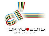
The Tokyo city as an Olympic city came up with their traditional idea for their logo design which displays their knot style famously known as MUSUBI. It integrates the five key colors of the Olympic into a pattern of intriguing and gaudy knotted strings which have been used in Japan to signify the consent during the Olympic celebrations.
This unique logo design of MUSUBI knot, integrates the values that highlight both the Olympic Movement and Tokyo in 2016. It connects sport and culture, urban and natural environment, Japan and the world, the world and peace.
Madrid – Spain
The logo design which has been made for the Madrid as a candidate city of Olympic is one of my favorite one. The Olympic colored hand logo design is simply breath taking. The logo design is a symbol which enlightening the persuasion of welcoming the foreigners to the city and its people, every color representing the different nationalities and cultures they wear.
The logo design for Madrid is known as "Corle" - The logos design received 31.96 percent of the vote, more than double received by the runner-up.
Prague - Czech Republic
The logo design for the Prague city of Czech republic was built on the ancient tradition of the olive branch for the Olympic winner. The branch has five flared leaves with the shadow in a form of wind born ribbons. Each leaves means of the one continent, combining the thought of the five continents of the sports world.
It is a tribute to the athletes from all around the world. The upper ribbons, below the branch, are in the colors of Prague: red and yellow. Below them is a blue ribbon which stands for the river Vltava that flows through Prague. The entire logo design should evoke movement.
Doha, Qatar
The Doha 2016 Olympic bid committee has revealed its campaign logo which is a green and purple representation of an aldahma flower. The Aldahma’s natural habitat in the sands of the desert draws a parallel with the vibrant and colourful life flourishing in the State of Qatar. The calligraphy strokes making the words ‘Doha 2016’ are a unique manipulation of the traditional organic Henna patterns that women use to adorn their hands and arms as part of social and holiday celebrations.
Rio de Janiero, Brazil
Everything about the Rio 2016 logo design strongly reflects the nature of the city (maybe more of a city logo than an Olympic logo). Although I think it could be stronger without the symbol. The text itself holds a lot of information. All in all the logo stands great as it’s the host city for 2016 Olympics.


0 comments:
Post a Comment