


What is street fighter? Street fighter is a combination of power, passion, attitude, arrogance and victory. It was the only game that drove me nuts when I was a kid. It had everything that I wanted in a game, whether it was the multi player action, characters stories, or the electrifying boss characters and so on. Over all, it was, and still a complete package.
Now about the street fighter game logos. They were just like the game itself; Stylish, innovative, attention grabbing and extreme. With every street fighter part, came a new logo. But the best part was that none of the logos were similar to the older ones (not even one). It is one of the best qualities of street fighter logos.
There have been many logo versions with each set of street fighter game series such as; EX series, Alpha series, Vs series and more. Every logo had the characteristics of speed, energy and futuristic era. Let’s have the logos now:
Street Fighter (1987)
 This was the first logo of the series and was definitely innovative. The red and orange shades of colors depicted the element of fire and force with extremely cool type fonts.
Street Fighter II series (1991–1996)
 The second logo had almost the same colors which the previous ones had, but in a reverse manner along with new type fonts. Really eye catching.
Street Fighter Alpha series (1995–1998)
Street Fighter EX series (1996–2001)
 Again the writing style of the logo was stylishly changed with “EX” written in the background. This time the text “street fighter” was in total blue with a shadow effect and “EX” was in a merged red and yellow color mode.
Street Fighter III series (1997–1999)
 This one has the lightning strike font feature which looks too appropriate to the game subject with the “III” written in the background. The colors match with the black background which is the best part of this logo.
Vs. series (1996–2003, 2008)
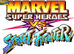 This is the most unlikely logo series of street fighter because it had so many colors and font styles which look amateur to me at most of the times.
Street Fighter IV series (2008, 2010)
One of the most mysterious aspects of the street fighter logos is their type fonts. Despite of attempting a lot of research I still couldn’t find the type fonts that were used in these logos. Therefore they are unknown till now but the most similar fonts to the street fighter logos in my opinion are; Informal Roman, Biffo MT, Brush 738, Zombie Guts Yanked Italic and Rapier.
Because of the space limitation I could not include all of the logos of each street fighter series category; however I mentioned the main logos of each series to enlighten the main ideas of the logos. If I succeed in reviving your gaming memories with this piece of writing please drop your comments in.

0 comments:
Post a Comment